Overview
When I joined Volta, we had basic app functionality that allowed our users to find charging sites and check in to get a charge. As the company shifted to a paid model of charging, this added many new complexities to the needs of Volta's charging companion app, which would no longer be optional for customers to use the company's service. What was once used minimally by some users, would now expand to the hands of every one of the company's customers worldwide.

My Role
As the only Product Designer on the team, I was tasked with preparing the current user experience to support the new user conversion, new payments model, and bringing the app up to modern standards so that it would meet the expectations of the current market.
Since we had very limited resources in staff, I was onboarded as part of the agile mobile team. I worked closely with six engineers and one product manager on a daily basis to determine feasibility and timelines of delivering incremental releases.

UX Audit
While evaluating the existing app, I noticed the design was breaking several standard principles and accessibility requirements that made it difficult to use and find the correct information.


Information Architecture
The first step was to map out the existing architecture to identify the current gaps in the user's journeys, and the opportunities for new features that were intended to build.

The updated architecture following UX Audit with new features accounted for.

Design System
The early UI was incompatible with current accessibility standards, and lacked overall brand. To fix the obvious issues, the basic design system needed some updating. I audited the current UI to identify high-impact changes that could be addressed immediately, then explored more options that could elevate the visual experience. Since the Design System is used as the building blocks of all forthcoming design output, it was crucial to address this asap to avoid future tech debt and common usability issues.


Guiding Principles
As a fast-follow to the Design System updates, I drafted some guiding principles for Volta designs intended to Align Product and Design on our values and guide upcoming design decisions.
Since I was the only designer on the team at the time, this was kept minimal, starting with the necessary principles required for an app to be considered in-line with current standards.
Other principles around brand, voice & tone, and UX patterns, were agreed to be added later as we learned more about our product.

Feature Enhancements
Once the Design System was handed off to engineering, it was time to tackle the gaps identified in the UX audit. There were multiple points of basic functionality that had not yet been accounted for. Since mobile users expect certain features and patterns in their apps, it was essential that we deliver enhancements to our existing features that satisfied their needs.
To get started, I partnered with our Product Manager to draft some requirements for each feature that could then be prioritized in terms of necessity and estimated engineering lift.

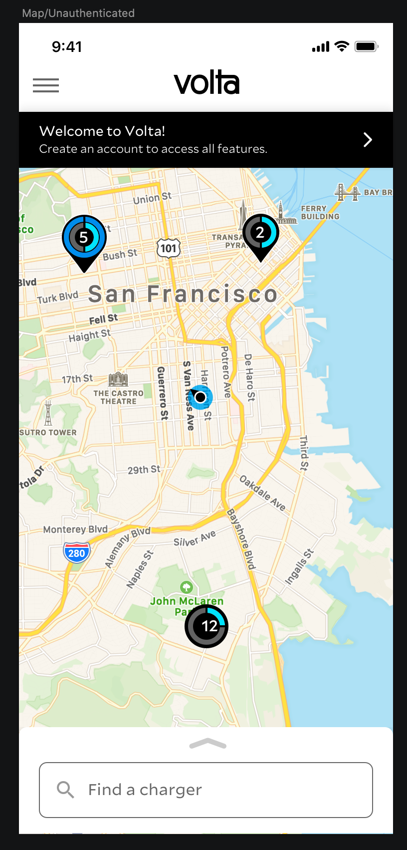
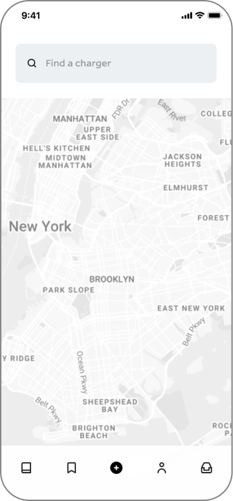
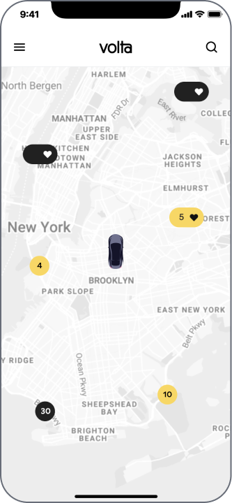
Search
Today users can access the search feature by tapping the Search Bar on the bottom of the Map screen, which becomes inaccessible once a Map Pin is clicked. This requires unnecessary interaction from the user to access the Search feature during their Map browsing experience, and has been noted in past user research sessions to be unfavorable to our users.
With the upcoming upgrade to React Native - and upcoming features, such as Favorite Sites and Filter By - the Search function needs to be more robust and inclusive of entry points to use these new features. This will be increasingly important as our app user base scales.


This feature was released in 2 phases.
[roadmap]
Other results


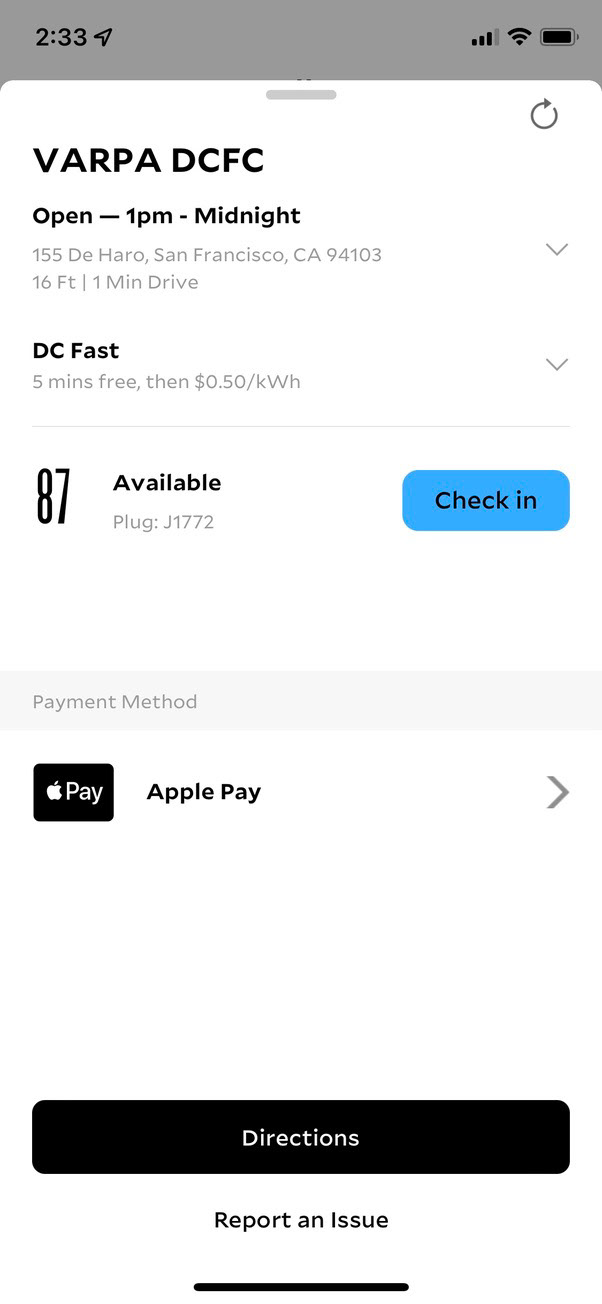
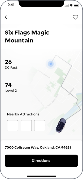
Site Cards
The Site Details card in particular needed some optimization, as it had become crowded, messy, and difficult to read - especially while driving. We needed to enhance the convenience of our charging stations for our customers, using the mobile app experience to guide users throughout their charging process.
Goals
Minimize cognitive load for users when finding a charging site and checking in
Enhance readability and visual hierarchy
Visually distinguish charger types and availability
Reduce excessive information where necessary
Enhance readability and visual hierarchy
Visually distinguish charger types and availability
Reduce excessive information where necessary
Maximize usability of Site Detail Card:
Provide guidance to users throughout their navigation and check-in process
Utilize location to surface the right information throughout the user’s journey
Provide guidance to users throughout their navigation and check-in process
Utilize location to surface the right information throughout the user’s journey


Results
This feature was released in 3 phases. Users reported a significant improvement in the check-in experience, and Volta saw a XX% increase in check-ins that month.

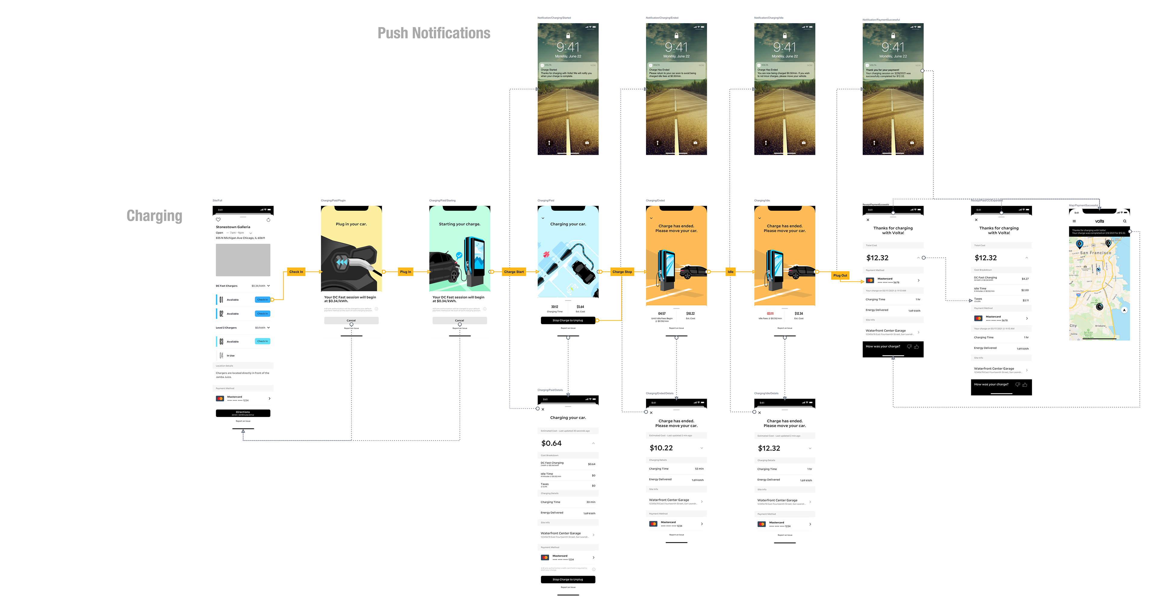
Charging


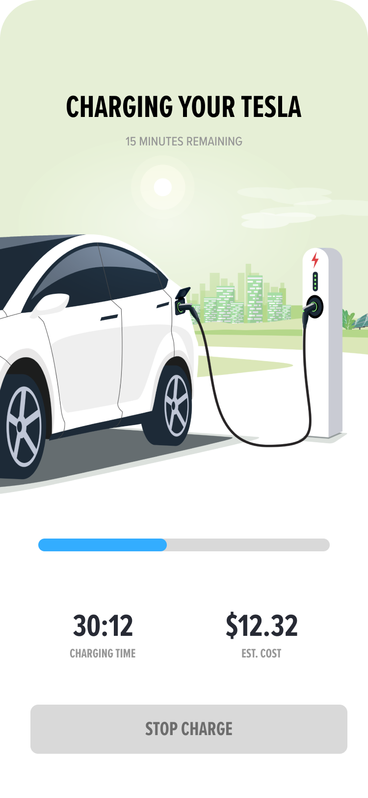


New Features
Now that many of the app's basic issues were being addressed, i began to take on designing the net-new features that Product Management and Leadership had reached alignment on. I began reviewing Product Requirement Documents with Product Management to strategize the best path forward.
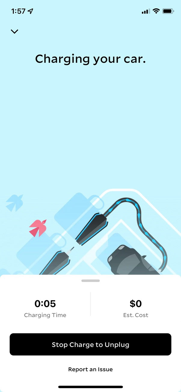
At the time, charging was completely free. However, as business goals shifted toward paid charging with the addition of DC Fast chargers at many locations, we faced the added challenge of getting users to adapt to the paid charging environment.

Idle Fees
To ease the transition of existing users to the new paid model, Volta decided to introduce Idle Fees for users who occupied a charging station after their free charge was completed. This required users to begin using the app to start a charge at select popular locations, and provide their payment information. This was an opportunity for the team to test the upcoming paid charging experience on a smaller scale with significantly less risks.
📝 Idle Fees
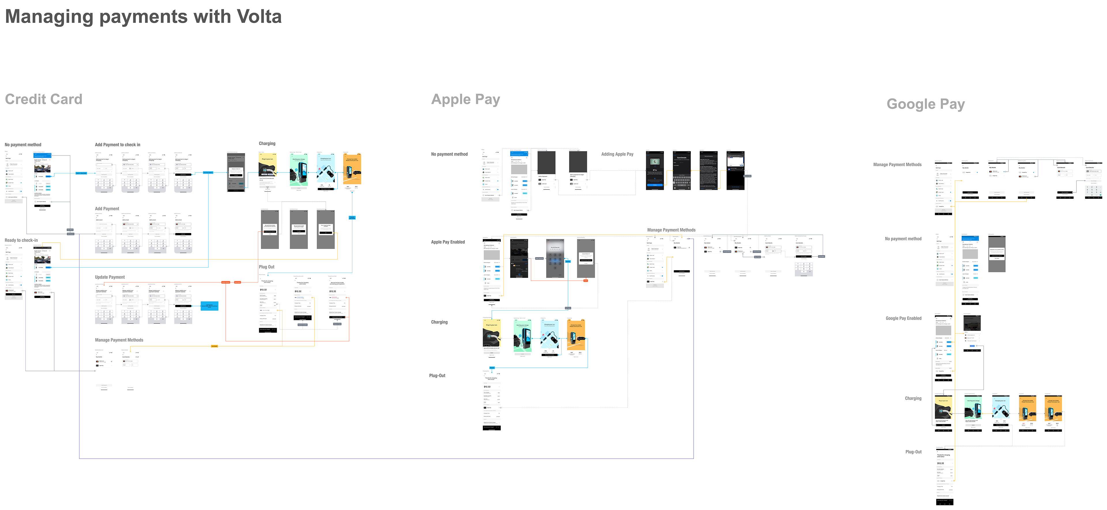
Paid Charging
Some users are now required to add a payment to charge at locations with idle fees. we needed to support the ability to add multiple types of payments that are preferred by our users based on their device type.
📝 Apple Pay 📝 Google Pay 📝 Add a Card 📝 Paid Fast Charging

Authentication
With payments going live we need to improve our account access security while balancing ease of access for legitimate users. Our current password security requirements are too lax and do not meet the PCI compliance password requirements, nor are they on-par with our competitors.
While we do not need to achieve every PCI compliance password and be at bank-level security we should improve our password security measures.
📝 Email Verification 📝 Password Requirements

Notifications


Charge History


Rate Your Charge


Suspended Charge